When working with columns of text across various layers in Photoshop it can become tedious adjusting each layer to create margins and gutters.
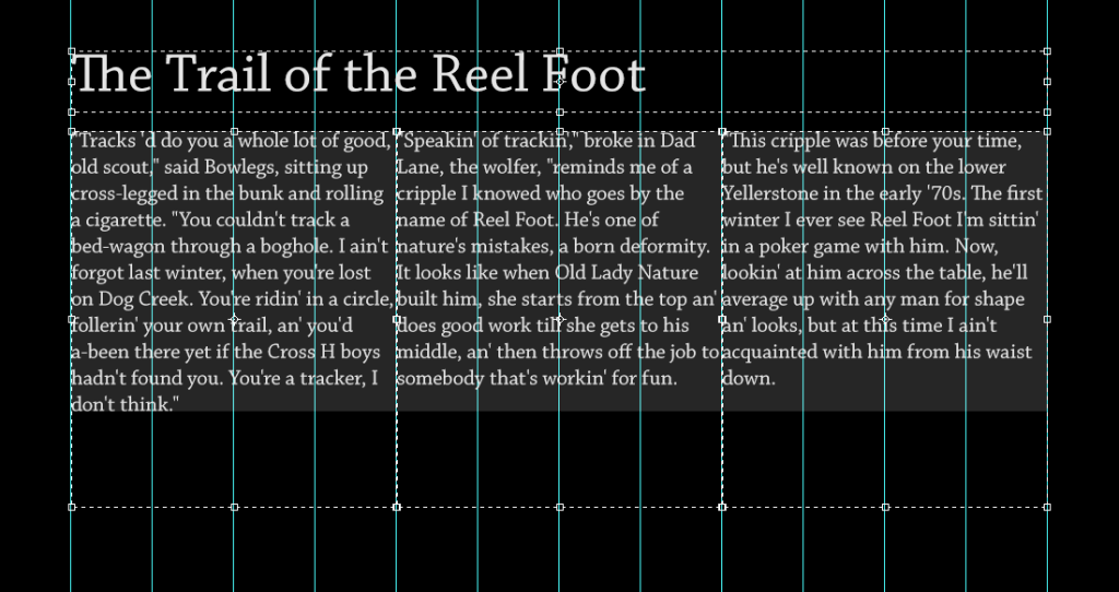
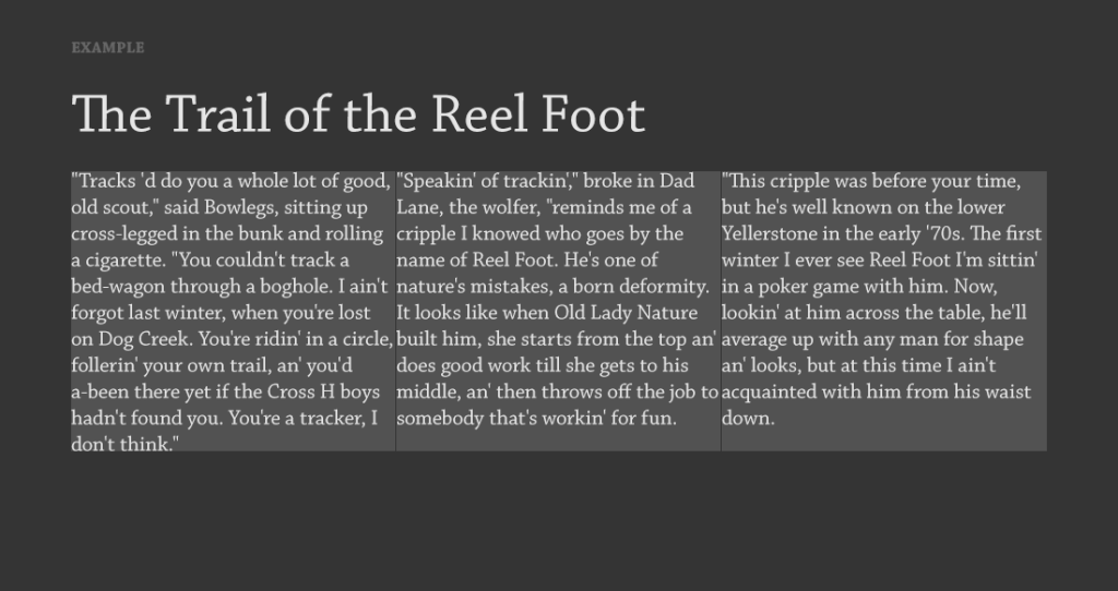
For example, let’s say you have three columns of text contained inside a box and aligned to a grid (I’m using a popular 960 grid system in my examples). Unless gutters are predefined, columns are going to butt up against each other. In some instances, even if gutters are predefined, there won’t be adequate spacing depending on the typeface and size being used.
If it weren’t for the dividers above, the text from one column would appear to bleed into the adjacent column. Obviously, this is no good. We could fix the problem by adjusting each individual bounding box, but there’s an easier way.
Open your paragraph options (Window > Paragraph).

The top two fields should read 0pt by default. These control margins for any selected text, or if no text is selected, the margins of the entire bounding box for the selected text layer(s) in the layers palette.
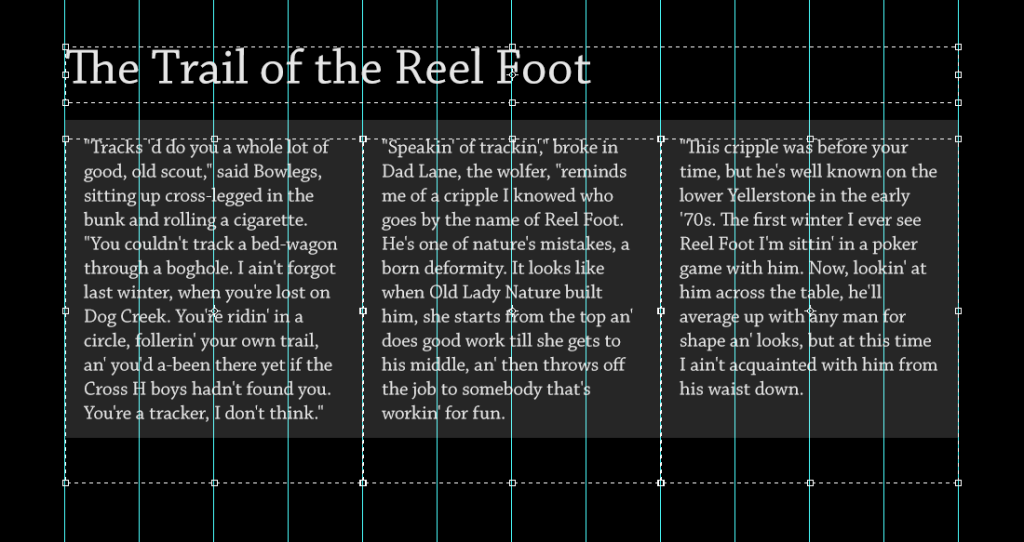
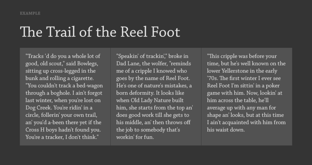
If I select the layers containing my three columns of text in the layers palette, I can indent the left and right margins of all my text at the same time.

Notice that the bounding boxes stay in the same place, but because I added 20pts to the left and the right of each column, there is now a 40pt gutter between each column of text, making it easier to read.
Margin Indents On Single Columns
Margin indents aren’t just useful for multiple columns, but because the content in a single bounding box can have different margins, they help save time laying out a single column of text as well.
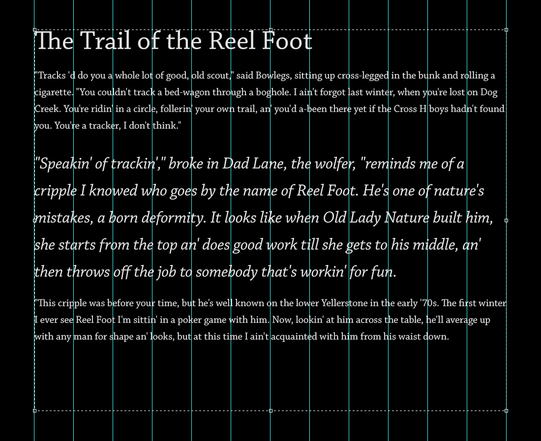
Below I have a simple article containing a title, a paragraph, an emphasized block of text, and a closing paragraph all laid out in a single bounding box.
The line lengths are a little long, so I want to shorten those up to make it easier to read. I also want the emphasized text to extend outside the main column of text to command further attention.
Since I only want the indent to apply to specific paragraphs I’ll need to use my text selection tool. First, I highlight the title and the following paragraph. With that selected I can change the margins to 160pts on each side. I’ll leave the emphasized text alone, and then highlight the last paragraph and change the margins to 160pts to match the opening paragraph.
It’s a simple tip, but one that’s saved me a ton of time laying out text in Photoshop.

Leave a Reply